


Gamified Student Website
Turning a gamified mobile learning experience about health and puberty into a desktop interface.


My Role
Learning Experience Designer
UX Researcher
The Team
Ayah Said - UX Designer
Bailey Alexander - UX Designer
Devan Guerra - UX Designer
Tools
Figma, Canva, Google Sheets, Google Suite, Asana

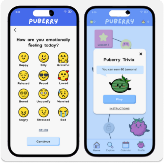
Original App Designs
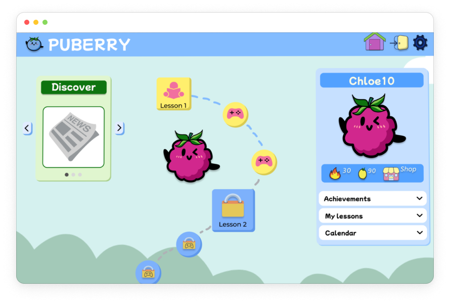
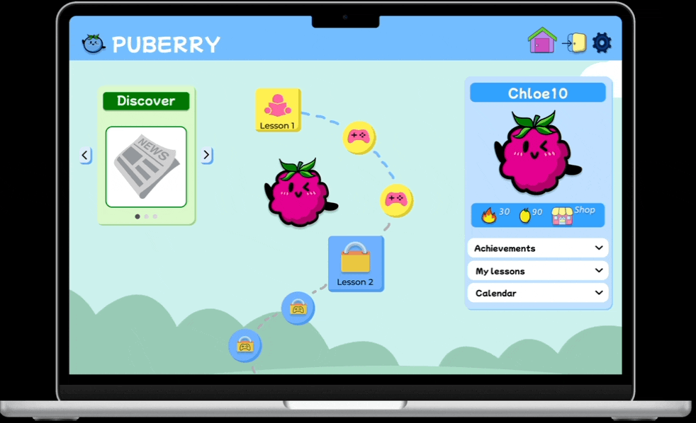
Final High-Fidelity Desktop Prototype


Discovery
User Persona: Chloe (6th grade student)

Competitive Analysis
In order to gain insights into what Puberry currently offers compared to other apps and websites for puberty education, a competitive analysis was conducted with apps like Clue, Informatica and Wonder: Daily Sex Ed for Teens.
Informatica Videos Screen

Image taken from App Store
Final High-Fidelity Puberry Lesson Page

Takeaways
Although Puberry is the only puberty education resource among its competitors that has a mobile and desktop/iPad adaptation of the interface, as well as a gamification feature, it’s also important that it maintains its competitive edge when it comes to accessibility and inclusivity by implementing an Audio feature and gender-inclusive language.
Usability Test Results
I created a usability research plan for the mid-fidelity prototype of the Puberry website for desktop and iPad based off of secondary research and client needs.
3 Tasks were Completed by Participants:
Task #1: Create an account.
Task # 2: Complete lesson 1 and the trivia that follows.
Task #3: Put a top hat on your berry profile.
Usability testing was conducted with 11 participants total:
4 kids (ages 8-9), which match the primary users initially targeted by Puberry.
2 teens (age 17), to include the broader target age range Puberry more recently began to target (ages 6-18).
5 educators, with the goal of gaining insight into their perspective previewing the website to decide whether to purchase it for their students.
Goals

100% of users will successfully complete all 3 tasks.
100% of kids will select the correct trivia answer on the first try.
The average system usability score will be Excellent.
Results

100% participants successfully completed all 3 tasks
100% kids (ages 8-9) selected the the correct trivia answer on the first try
System Usability Score: 86.6 (Excellent)
Task #1: Create an account.
This task was created in line with the client’s need for feedback on how users interact with the sign up step of selecting whether the user has a period, whether they want to turn their period tracker on, and their process of logging their feelings.
Results
Final High-Fidelity Prototype (only design change: including “skip” option)

All participants successfully navigated this task.
All participants participants shared positive feelings about the period tracker and logging their different feelings.
1 educator recommended including the option to skip when users are selecting how they feel.
“I like how I have the option to turn my period tracker on and off.”
“Students checking in with their feelings is really important.”
Task #2: Complete lesson 1 and the trivia that follows.
Not only does the usability of the core educational and gamified section of the website need to be tested, but also measuring whether students are actually learning from the content, as requested by the client.
Mid-Fidelity: Lack of Accessibility
Half of the child participants (ages 8-9) struggled reading and understanding specific words (like “acne” and “pubic”).

High-Fidelity: Including Accessibility Features
Upon hovering over pink underlined words, a popup will appear with the word, the phonetic pronunciation and the definition.
Users will also have the option to hear how the word is pronounced by selecting the Audio icon.

Value
Users will have the option to use these reading scaffolds that include visual and auditory supports in the pronunciation and understanding of the word. This offers users more independence and autonomy when completing Puberry lessons.
Task #3: Put a top hat on your berry profile.
The objective is not only to test the general navigation and feature prioritization of the homepage, but also to test the usability of the website and gain feedback from the users concerning the gamified incentive of using lemons won in lessons to acquire accessories.
Homepage Navigation
Some users struggled finding the Shop icon on the homepage.
Mid-Fidelity: Cluttered

High-Fidelity: Condensed
Value
Including the Shop icon next to the streaks and lemon count under the profile ensures all of the icons relating to incentives are in one organized and digestible space on the homepage.
Consolidating the “Any Questions?” icon in the rotating carousel results in a less cluttered homepage, allowing the lessons roadmap to stand out.
The carousel switches independently and can also be manually manipulated using the arrows. The Shop feature is included in order to ensure high visibility for one of the central features of the gamified website.
Global Navigation Bar
Some users struggled returning to the homepage from the Shop page
Mid-Fidelity: Unclear Navigation Bar
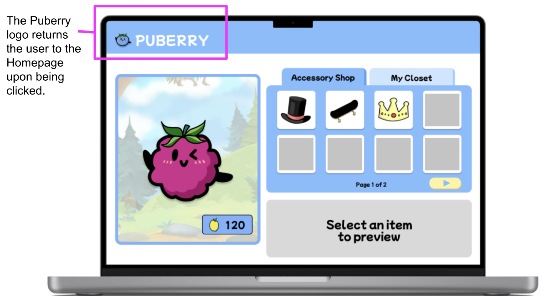
High-Fidelity: Clear Navigation Bar

Value
Including the Home icon in the global navigation bar offers another visual to navigate back to the homepage. By also including the Settings and Log Out icons, we are matching what users will encounter in the real world on many other websites with these easy-to-access options available at all times.
High-Fidelity Prototype
Below is a recording of the high-fidelity prototype after applying the previous design decisions based off of usability test findings.
Due to time constraints, 1 usability test was conducted on the high-fidelity prototype:
The user successfully navigated to the Shop page after completing Lesson 1.
The user successfully navigated back home from the Shop page.

Conclusion
Puberry's goal of being inclusive to all users by offering a desktop and iPad interface of their website that is designed based on users’ needs was accomplished. In addition, its design has been influenced by educators’ needs and their in-depth knowledge of their students. One of the biggest challenges was the feature prioritization in the design of the homepage, ensuring the most important features from the mobile website were effectively placed in a cohesive way. I was able to contribute to creating an organized and minimalist design through conducting a comparative analysis of the feature prioritization of other adapted mobile-to-desktop gamified websites, a heuristic evaluation of the information architecture of these websites, and usability test findings. Now, students like Chloe can easily navigate the homepage and the website from their desktop, efficiently finding and using the features that will enhance their puberty learning.
Recommendations for Next Steps
Based off of usability test findings and user needs, the following next steps were recommended to the client, Puberry.
Continued Usability Testing

Due to time constraints and a limited pool of participants, all kids and teens who participated in usability tests identified as female.
By continuing usability testing with participants who identify as male, gender non-binary and who are trans, Puberry can gain more diverse feedback that will ensure their website is, in fact, inclusive.
Puberry for Teens
All teens (age 17) shared they would like to use Puberry if it was made for teens.
Puberry wants the website to be for all kids interested in learning about puberty, ages 6-18.
It’s recommended that, as students mature, so will the content and the UI of their lessons and interface, assuring that the Puberry experience will mature with them as well.

Suggested Puberry for Teens Color Palette