
Gamified Student Website
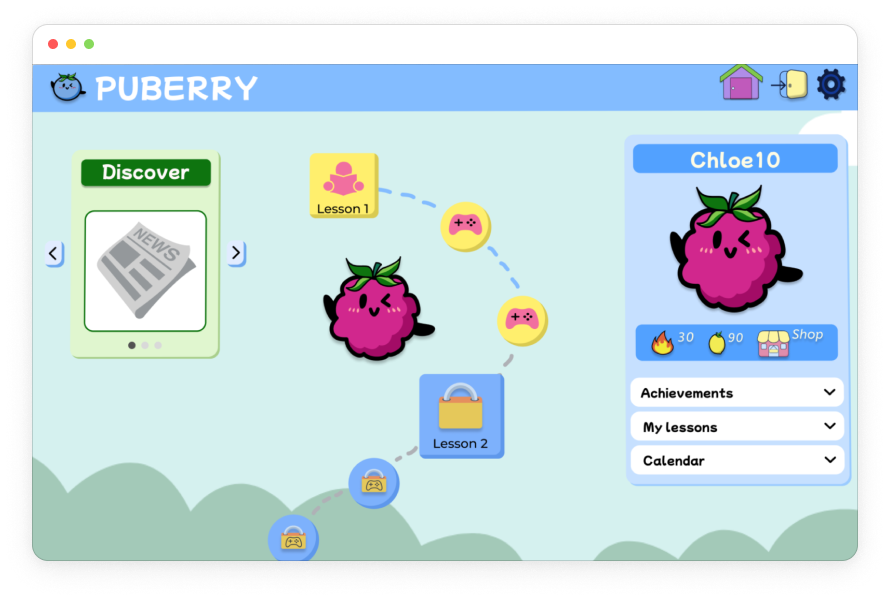
Designing a gamified health and puberty learning experience for learners ages 8-12.


My Role
Learning Experience Designer
Cross-Functional Teams
UX Design
Research
Tools
Figma, Canva, Google Sheets, Google Suite, Asana, Gagne’s 9 Events
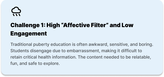
The Learning Challenge

Needs Analysis
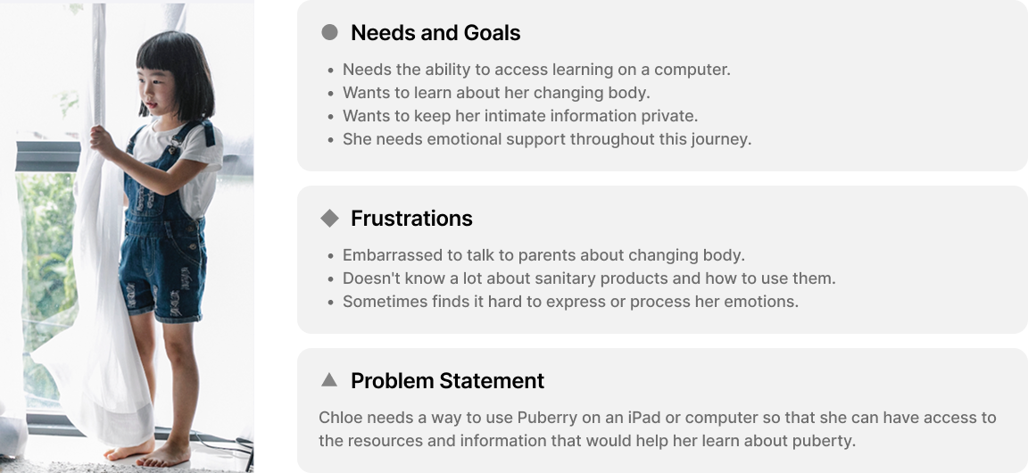
Learner Persona: Chloe (6th grade student)

Competitive Analysis
In order to gain insights into what Puberry currently offers compared to other apps and websites for puberty education, a competitive analysis was conducted with apps like Clue, Informatica and Wonder: Daily Sex Ed for Teens.
Informatica Videos Screen

Image taken from App Store
Final High-Fidelity Puberry Lesson Page

Takeaways
Although Puberry is the only puberty education resource among its competitors that has a mobile and desktop/iPad adaptation of the interface, as well as a gamification feature, it’s also important that it maintains its competitive edge when it comes to accessibility and inclusivity by implementing an Audio feature and gender-inclusive language.

Learner Analysis
I created a usability test plan for the mid-fidelity prototype of the Puberry website based off of secondary research and learner needs to ensure the learning platform is not only effective but also enjoyable.
3 Tasks were Completed by Learners:
Task #1: Create an account.
Task # 2: Complete lesson 1 and the trivia that follows.
Task #3: Use points won to customize their character.
Usability testing was conducted with 11 learners total:
4 kids (ages 8-9), which match the primary learners initially targeted by Puberry.
2 teens (age 17), to include the broader target age range Puberry more recently began to target (ages 6-18).
5 educators, with the goal of gaining insight into their perspective previewing the website to decide whether to purchase it for their students.
Goals

100% of learners will successfully complete all 3 tasks.
100% of kids will select the correct trivia answer on the first try.
The average system usability score will be Excellent.
Results

100% learners successfully completed all 3 tasks
100% kids (ages 8-9) selected the the correct trivia answer on the first try
System Usability Score: 86.6 (Excellent)
Personalization & Customization
This task was created in line with the client’s need for feedback on how learners interact with the sign up step of selecting whether the learner has a period, whether they want to turn their period tracker on, and their process of logging their feelings. This provides the learner an opportunity to customize their experience, and the platform can use certain information to personalize content based on the learner’s interests and needs.
Results
Final Login Flow

All learners successfully navigated this task.
All learners shared positive feelings about the period tracker and logging their different feelings.
1 educator recommended including the option to skip when learners are selecting how they feel to ensure a low affective filter in the learning experience.
“I like how I have the option to turn my period tracker on and off.”
“Students checking in with their feelings is really important.”
Lesson Chunking
To ensure learners are actually learning from the content, lesson content was chunked and I applied interactive elements to provide learners with the option to choose differentiations to make the learning experiences accessible (hover definitions and audio read-aloud features).
Initial Learning Design
Half of the child learners (ages 8-9) struggled reading and understanding specific words (like “acne” and “pubic”).

Final Learning Design
Upon hovering over pink underlined words, a popup will appear with the word, the phonetic pronunciation and the definition.
Learners will also have the option to hear how the word is pronounced by selecting the Audio icon.

Value
Learners have the option to use these reading scaffolds that include visual and auditory supports in the pronunciation and understanding of the word. This offers learners more independence and autonomy when completing Puberry lessons.
Learner Autonomy and Rewards
An important aspect of Puberry is the gamification incorporated in the lesson modules, such as the gamified incentive of using lemons won in lessons to acquire accessories. This functions as additional extrinsic motivation to make the learning experience one’s own by providing the option for learners to customize their own characters.
Homepage Navigation
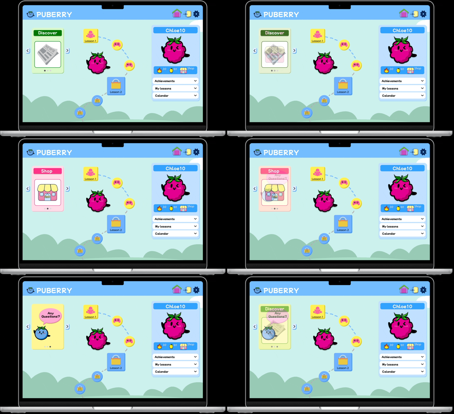
Some learners struggled finding the Shop icon on the homepage, which affected their understanding of what they could do with the lemons they won, essentially obstructing the positive impact around motivation and gamification.
Initial Learning Design

Final Learning Design
Value
Including the Shop icon next to the streaks and lemon count under the profile ensures all of the icons relating to incentives are in one organized and digestible space on the homepage.
Consolidating the “Any Questions?” icon in the rotating carousel results in a less cluttered homepage, allowing the lessons roadmap to stand out while still providing visibility for learners who would like to ask anonymous questions to build on their learning and metacognition.
Final Learning Experience

Conclusion
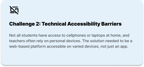
This project successfully transformed a static health resource into an inclusive, multi-device learning platform. By collaborating closely with educators (SMEs) and prioritizing learner needs, my team overcame the challenge of delivering sensitive content to a young audience.
Through rigorous iterative testing, we streamlined the information architecture to drastically reduce cognitive load. The final design ensures that learners have a low-friction environment where they can look past the awkwardness and engage deeply with critical health curriculum on any device.
Recommendations for Next Steps
Based on findings from learner feedback and results, the following next steps are recommended:
Continued Usability Testing

Due to time constraints and a limited pool of learners, all kids and teens who participated in pilot testing this learning experience identified as female.
By including learners who identify as male, gender non-binary and who are trans, Puberry can gain more diverse feedback that will ensure their this learning experience is, in fact, inclusive.
Puberry for Teens
All teens (age 17) shared they would like to use Puberry if it was made for teens, highlighting a learner need.
Puberry should be for all kids interested in learning about puberty, ages 6-18.
It’s recommended that, as students mature, so will the content and the UI of their lessons and interface, assuring that the Puberry experience will mature with them as well.

Suggested Puberry for Teens Color Palette

